The Flexbox
Basics
A flexbox is a one-dimensional layout for arranging items in rows or columns. Items expand to fill additional space or shrink to fit into smaller spaces.
To create a flexbox, you need to set the display property of the parent of the elements you want to include in the flexbox to flex:
<div class="parent">
  <div class="child">1</div>
  <div class="child">2</div>
  <div class="child">3</div>
</div>
This causes the parent element to become a flex container and the direct children to become flex items.
.parent {
  display: flex;
}
You should also give the elements a border and the children a background color to make it easier to see the layout:
.parent {
  border: 1px solid red;
}

.child {
  border: 1px solid black;
}

#child-one {
  background-color: lightblue;
}

#child-two {
  background-color: lightgreen;
}

#child-three {
  background-color: lightcoral;
}
The Flex Model
You can influence the direction of the flex items by setting the flex-direction property.
By default, this is set to row, which means the items are laid out horizontally in a row.
You can also set it to column which lays out the items vertically in a column.
Additionally, there are the
row-reverseandcolumn-reversevalues which reverse the order of the items.
To understand what this does, let's first look at the flex model:
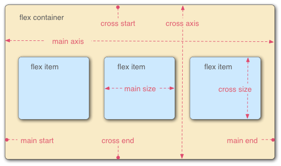
The flex model has two axes.
The main axis is the axis running in the direction the flex items are laid out in.
In our current example, the items are laid out horizontally and so the main axis is horizontal. The start and end of the main axis are called the main start and main end. The length from the main-start edge of each item to the main-end edge of each item is the main size.
The cross axis is the axis running perpendicular to the main axis. In our example, the cross axis is vertical. The start and end of the cross axis are called the cross start and cross end. The length from the cross-start edge of each item to the cross-end edge of each item is the cross size.
If we set the flex-direction property to column instead of row, then the main axis will be the vertical axis and the cross axis will be the horizontal axis.
This means that all of the concepts that we will discuss in this section will apply to a column layout as well except with the axes swapped.
Wrapping
If your children are overflowing the container, then you can use the flex-wrap property to wrap the children.
Consider our running example:
<div class="parent">
  <div class="child">1</div>
  <div class="child">2</div>
  <div class="child">3</div>
</div>
.parent {
  display: flex;
  border: 1px solid red;
}

.child {
  border: 1px solid black;
}

#child-one {
  background-color: lightblue;
}

#child-two {
  background-color: lightgreen;
}

#child-three {
  background-color: lightcoral;
}
Let's add a width to the parent and the children:
.parent {
  width: 200px;
  flex-grow: 0;
  flex-shrink: 0;
}

.child {
  background-color: gray;
  width: 100px;
}
We need to set flex-grow and flex-shrink to 0 to prevent the flexbox from trying to intelligently fit the children into the container (more on this later).
Since we have three children with a width of 100px and the container has a width of 200px, the children are overflowing the container.
You can fix this using the flex-wrap property which basically tells the flexbox to wrap the children to the next line if they don't fit in the current line.
.parent {
  flex-wrap: wrap;
}
The wrapping behaviour means that even though the flexbox is technically a one-dimensional layout, you can actually use it to implement two-dimensional layouts as well.
Aligning Items
You can use the justify-content property to control how the positive free space is distributed around your flex items.
.parent {
  justify-content: flex-start;
}
This is one of:
flex-start: Items are packed toward the start of the flex containerflex-end: Items are packed toward the end of the flex containercenter: Items are centered in the flex containerspace-between: Items are spread out evenly in the flex container with equal gaps between each pairspace-around: Items are spread out with equal space around each item (i.e. gaps between items are twice the gaps at the ends)space-evenly: Items are spread out with equal space between items and at the ends
You can use the align-items property to control how the items are aligned along the cross axis.
To see what this does, let's add a height to the parent:
.parent {
  height: 200px;
}
Now, you can set the align-items property to one of the following values:
stretch: Items are stretched to fill the flex containerflex-start: Items are packed toward the start of the flex containerflex-end: Items are packed toward the end of the flex containercenter: Items are centered in the flex containerbaseline: Items are aligned based on their baselines
If you only want to align a single item, you can use the align-self property, e.g.:
#child-one {
  align-self: flex-start;
}
You can also distribute the items along the cross axis using the align-content property.
This will only have an effect if you have flex-wrap: wrap (or wrap-reverse) in your flex container and enough items so that they wrap.
The align-content property takes similar values as the justify-content property.
Gaps
You can set gaps between rows and columns using the gap, column-gap, and row-gap properties:
.parent {
  column-gap: 20px;
  row-gap: 30px;
}
This allows more granular control over the gaps between rows and columns than the other alignment properties.